Friday, 18 May 2012

Assessment Show!

These are the pieces from the project I am showing in my final show. They are far removed from the experiments relating to skin I had conducted. I have changed my project completely since then. I no longer am doing it on that topic but rather on the figure in general.  I needed to broaden my project in order to be better able to gain ideas and produce work less stifled by concept. So I did.


The work above was inspired by a series of photographs I had manipulated. I found a folder of old family photographs that belonged to my grandmother. They must have been taken around five or six decades ago. Most were monochrome but there was the odd colour one. I had the strange and unaccounted for idea of using pixilation on them. An image of a person on the television who had their head censored spurned this. I used Photoshop to achieve the effects. I did many of them and used many different and intriguing effects. 


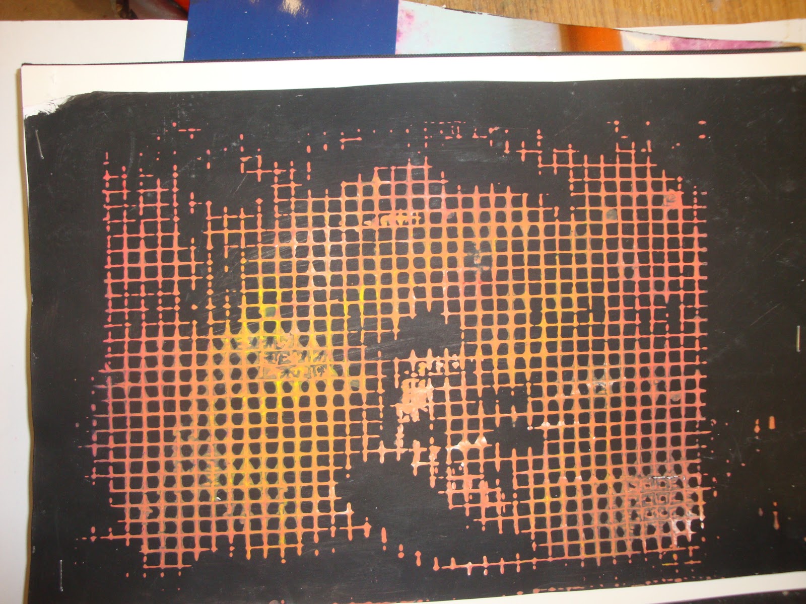
You may ask how did this inspire them as they seem to have no relation. An image of a blond child disrupted by pixilation conveyed to me the idea of everything being divided into cells - as in a grid. So I got a piece of material that was structured in a grid format and applied paint on it and made numerous prints. The one above was the most successful. I love the manner in which the colour tone changes from left to right. It seems to vibrate against the lifeless black background. I also like how it refused to print in certain areas for some reason - this was perhaps due to ineffective application of paint. 

I was also working on gesture drawings during the same period. I wanted to make my drawing style a little loser and less formal and strict. I wanted to only draw the basics and suggest an item using as less lines as is possible. I wanted more vitality and expression in my draughtsmanship. I decided to combine  both the grid and these loose lines to make the following works. I became entranced by using paint in strange and outlandish ways. I love using the card to remove it, leaving a faint hint of what was once an opaque stroke. I liked taking something so definite and measured like a grid and dragging paint across it. It completely obliterates the stern power it would have had I had left it as it was originally printed.

Tuesday, 8 May 2012

Skin!


Originally my project was going to deal with the relationship between colour and how this can be used to describe and convey human emotions and thinking. However, I found this was extremely difficult to get ideas from so I have decided to change to looking at the human being in a different manner. I have decided to look at skin and how this translates to paint. I am interested in how human beings approach skin and view it. This is an experiment I did. I mixed paint with toothpaste and it created a lovely consistency. I used toothpaste because it is a cleaning product. It is used to clean teeth and refers to the cleaning of the body and how we have such a preoccupation with it. I wanted to combine both concept and medium without being pretentious or overt about it.


This is just latex poured on top of it. I was trying to recreate the texture of skin and perhaps the appearance. Not sure if it is entirely successful but it is rather interesting none the less. 


This was made by applying a layer of PVA on a sheet of white card. I then applying toilet roll and a further layer of PVA. Then, using a strong piece of plastic card, I stretched blobs of paint across it. I really like affect and how the paint mixes with the PVA. However, if you do too much work it can cause the toilet roll to combine with both mediums and it all becomes a repulsive mess. Restraint is key.
I was interested in recreating the look of stretch marks but in a very free and abstract manner. I don’t want to necessarily recreate a photograph. That would be rather pointless to me at the moment. It serves no purpose in the context of my project. 

Wednesday, 25 April 2012

Identifying Subject Matter!


We have begun a project on identifying subject matter. We had to collect some images to appropriate and use them as tools to help us along the way. The images I gathered were all very mysterious and emotive and dealt with the human condition. I realised after that they are all dealing with the figure. Two are from Andy Warhol’s very famous Screen Tests.


The two images above were taken by a famous spirit photographer William H. Mumler. Whether they are a hoax or not is unimportant. They are very special and unique documents.


Albrecht Dürer

Portrait of Oswolt Krel

1499


Friday, 13 April 2012

Painterly Studies!


I made so many of these little painterly studies yesterday. The method is very simple but effective. I painted on laminating sheets and then placed paper on top. I allied pressure to it and then ripped it off slowly. This is very similar to printing. I really like how I can create marks that I could not normally create with a brush or any other instrument. I act of transferring and pulling can only do this. It is evident that  I have paid a lot of attention to my mark making as of late. I am always searching for new ways to create unusual smears and smudges. What I find with these pieces is that at first I may hate them. However, when I look at them hours or days later I might love them. This has taught me not too throw studies away so easily. It was a terrible habit. It is far better to leave them for a few days to see if I have a change of heart or to see what I can salvage from the mess. I learned that I could hate 90% of a picture I make but if the 10% is brilliant or worthy of note then it deserves to survive.


I adore the manner in which the orange paint seems to vibrate against the bright pink background. It creates a great visual effect.  It is perhaps what Bridget Riley might create if she was more painterly and expressionistic. 


I feel this is my most successful one. I love how the use of paint is invigorated by using a plain, unfussy background. Simplicity is best. In fact, I read a great book this week that informed me that drawing is simply the act of simplifying. This is a statement that is so true and yet I have never discovered it for myself or had it revealed to me in all my years of sketching. Must not be paying enough attention to what I’m doing!


Some paint I used was made very liquid. This caused it to stain the paper instead of simply sit on top of it. When this is combined with opaque and dramatic strokes it can create a three-dimensional affect. It is also similar to the effect the bleach has.

Wednesday, 4 April 2012

Bleach and lots of it!


Here are some experiments I have done using bleach on sensitive paper. My tutors saw an old sketchbooks of similar experiments I had done in first semester and suggested I bring those into this project.  I decided I focus on how I apply the bleach so as to take an approach that is distinct from that used subsequently in October to December. I had dripped it on paper strewn on a floor previously. I decided to spray it on paper hanging on a wall to see what affect it would have. I also layered sheets on top of each other on the ground and sprayed a large amount and watched it soak through. This created faint and ghostly blotches on each sheet. It has the effect of splashes of water or a wave lushly rolling upon the sand on a beach. I like how understated they are.


Friday, 30 March 2012

Progress!


I’m afraid I haven’t a picture of the first piece I produced as my camera is broke. It was inspired by the pictures of the slanted bank of the canal. The white stains on it really captured my attention.  I decided to paint on a completely smooth surface. I am accustomed to painting on canvas which has a grain. I decided a black bin bag would be suitable. I was enraptured by the way the paint falls, drips and rolls down it. I make the paint especially watery and liquid and applied it using a sponge. This proved great as it allowed me to pull and drag the tainted white in alien ways to me.


These are two experiments that I feel have great possibilities. The one on the left was made using toilet roll and latex. I dipped the toilet roll in latex and layered it. I was excited by how the latex changes colour significantly once it has dried. It has a coarse, rough feel which is interesting. The one on the right was made using Styrofoam, silver spray paint and cardboard. I attached the Styrofoam to the brown cardboard and sprayed. The spray paint dissolves the Styrofoam and creates an effect as seen in the photo. I love the way you can control the result by how much you spray and how lightly or heavily you do so. I also like the smooth texture it creates. 


I applied latex over it later. It gave something that seemed very industrial and synthetic a rather natural appearance. It looks rather disgusting.


This was made using salt, red ink and latex and water. I mixed a tiny drop of red ink with the salt and placed it on cardboard. I then dripped latex over it. It doesn’t really apply to any of the photographs I had taken. I am fascinated with latex and am just going crazy looking at ways to manipulate it. I love how all these experiments are turning out abstract. I am normally rather figurative so this is a complete revelation. 


I glued strands of a black bin bag to cardboard and placed latex on it. Then I ripped it off days later. I love how it keeps it shape. I love how the latex would suggest different things to different people. I also like how when light reflects of the black bag it creates a light blue sheen. Its rather poetic. 


I made this by mixing random paints in a pot with offshoots of straw from a bail at home in my shed. I didn’t like the effect it had on its own so I applied latex over. It doesn’t look necessarily great but it is interesting to touch. I am really getting interested in making things people can touch. Normally people are not allowed touch paintings. Feeling something is a great way of seeing it in a more informed and perhaps unusual way. 

Saturday, 24 March 2012

Painting Project!

I am delighted I got into Painting. All the stress and nervousness I felt beforehand was uncalled for. We have started a project that deals with materials and artistic processes. I am really excited to do it. It will allow for some experimentation and I am hoping I can finally focus on something besides concept or narrative. I find that sometimes too much emphasis is placed on this and craft is left out in the cold. I have collected a group of photographs to work from and use as a springboard for ideas. I would of usually waited until the weekend to do this at home. It is there that I believe I would find more exciting imagery. However, since I only had a few days to do this I decided to take a walk around Grove Island to see what I could find. I took a lot of photographs of the rugged bark of trees and the slimy banks of the adjacent canal. I cannot wait to see how these will translate into paint. Here are some samples:


Thursday, 9 February 2012

Clutter!

Clutter! Clutter! Clutter! I was confused for ages on what to do in accordance with this project. At first I had the idea of doing my bedroom which was rather messy and covered in countless strips of white paper from cutting and contextual work. That seemed rather boring to do a print of and would probably look immaculate as a sculpture. So i decided just to check up clutter on the internet and research the meaning. Bingo! I came across a definition that suited me down to the ground:  Cluttered speech is a common term for speech that becomes broken down, cluttered, or unintelligible due to a variety of reasons. Cluttered speech is often described as hurried, nervous and broken down. Cluttered speech happens extensively with the speech disorder of cluttering, but is more commonly found in various disorders and especially in normal speech not associated with the disorder of cluttering.

An image immediately popped into my head. I decided to go with it and let it develop naturally. I used the white paper and placed strips in my mouth and took some photographs. These symbolized stammering or stuttering relating to public speaking and expressing oneself. I also sensed that it was almost a metaphor for the slang term 'Word Vomit,' which is defined as basically uncontrollably saying something you wish you had not. I looked in the mirror so as to see the camera reflected. This allowed me too have some control over composition. I was lucky that one of the four photographs taken was perfect! 

I edited it slightly on my computer to make it easier to translate as a drypoint etching and give me an idea of its appearance in its final stage. I did such things as heightened the brightness, contrast and deepened the shadows. I also played with the colour temperature. These are basic things that you do not even need Photoshop to accomplish. 


The resulting image reminded me of this infamous album and its rather striking cover: Madonna's Erotica. This was supposedly inspired by the work of Andy Warhol.


I also found this image which I like a lot. Just infusing some rather ultramarine tones can do an immense amount for an image.


Tracey Emin

I am a great admirer of Tracey Emin. Her art is brimful of substance and rather unstylist; it has a gritty, spirited nature. The only comparison that seems to do it justice is the following: It is similar to the misshapen objects ( I distinctly remember making my mother an ashtray) that a child would make for a parent in primary school but it is all the more special in its uniqueness.  

Here's an interview; Emin always provides interesting food for thought.


Käthe Kollwitz

I have become fascinated with this person's work. It is brimful of feeling and compassion. I am a particular admirer of artists who use their work as a means of trying to create social change or expose injustice; Kollwitz does this in such an honest and affecting manner that it is difficult to ignore. I love how in many of her prints she uses very violent and graphic lines that read as very basic but have an immense visual power. Her figures swim in complete darkness and seem to emerge like ghostly effigies. She uses chiaroscuro dramatically but her images don't seem like heightened, deformed comments on the human condition. They just seem truthful and candid.


Animal Farm!

These images play on the idea of the silhouette. They refer predominantly to traditional silhouette portraiture. This stemmed from my interest in shadow play and such. They depict the profile of a female; I distorted her to give her the unmistakable features of a pig. I was inspired to do this by reading a the text of Eretica: The Transcendent and the Profane in Contemporary Art. The text of the book commented on a piece by Jenny Saville entitled Suspension. It depicts the bloodied carcass of a boar. 


What i found engrossing was the comment the author made on our appalling attitude towards pigs (and perhaps animals in general). He denoted how we used the word 'Pig' as an insult yet we are willing to use their organs as a means to keeping us alive through transplants. This enlivened my imagination and the image just appeared; it regards how their in a space between the animal and human world, between species. By giving the girl the physical components of a pig I am bridging that gap, I am playing with space and denoting its negative aspects. 


I quite like the colours used. The sky blue and strong pink bounce brilliantly off each other but give a rather synthetic feel to the prints. These colours do not normally collide in nature so they create a rather dreamlike effect whose success depends on the eye and taste of the beholder. I always like to thing they represent opposites in a sense; Blue denotes a boy at birth, pink indicate a girl. Space between the sexes? Perhaps, Perhaps not. I did not spent ages deciding on the colours. I just randomly chose them in a quick manner. I wanted to see how they correspond to each other. The use of green works surprisingly well also. Pink and green complement each other (just about) so they heighten their impact when placed together. The blue induces a sense of coolness into pieces seemingly predominated by warm tones. 


I think the image itself is rather weak. In retrospect, I feel I could of done more with it. It is too basic too be visual engrossing as a print. Its flat nature seems rather graphic and almost intrusive on one or two of the prints. It seems like too images cobbled together in many respects. I sense that I should of taken a more realistic treatment and perhaps prepared a drypoint etching. I could of easily used multiple and complex versions of the pink to describe a pig's skin and made an effort to describe texture. I could of even printed on a flattened football as early soccer balls were made from inflated big bladders. 

Tuesday, 7 February 2012

More of mine!

I paint self-portraits because I am so often alone, because I am the person I know best.

[info][add][mail]
Frida Kahlo


This image is the result of about six different printing processes. I kept places colour on the plate at random using a cloth to make interesting strokes and streaks. I am liking how i used darker hues for shading. The background works surprisingly well in  my belief. The colours seems to integrate to create an harmonious yet somewhat gritty, repulsive air. I really feel experimentaion with colour had an integral part in this project for me.


This is a print on 3D graph paper that I happened to buy on a whim in HMV some time ago. I am glad that it came in handy. 


I printed this image in paper I had used in semester one. I had applied bleach to the paper by using a sponge and also by throwing it vigorously on it. This caused this pale yellow stains that are surrounded by an ethereal green glow.  I particularly like how the application by sponge makes a mark that seems like bacteria seen through a microscope. I decided to print on this just to see how it looks. The line that seems to divide the face reminds me of Henri Matisse's The Green Line.